

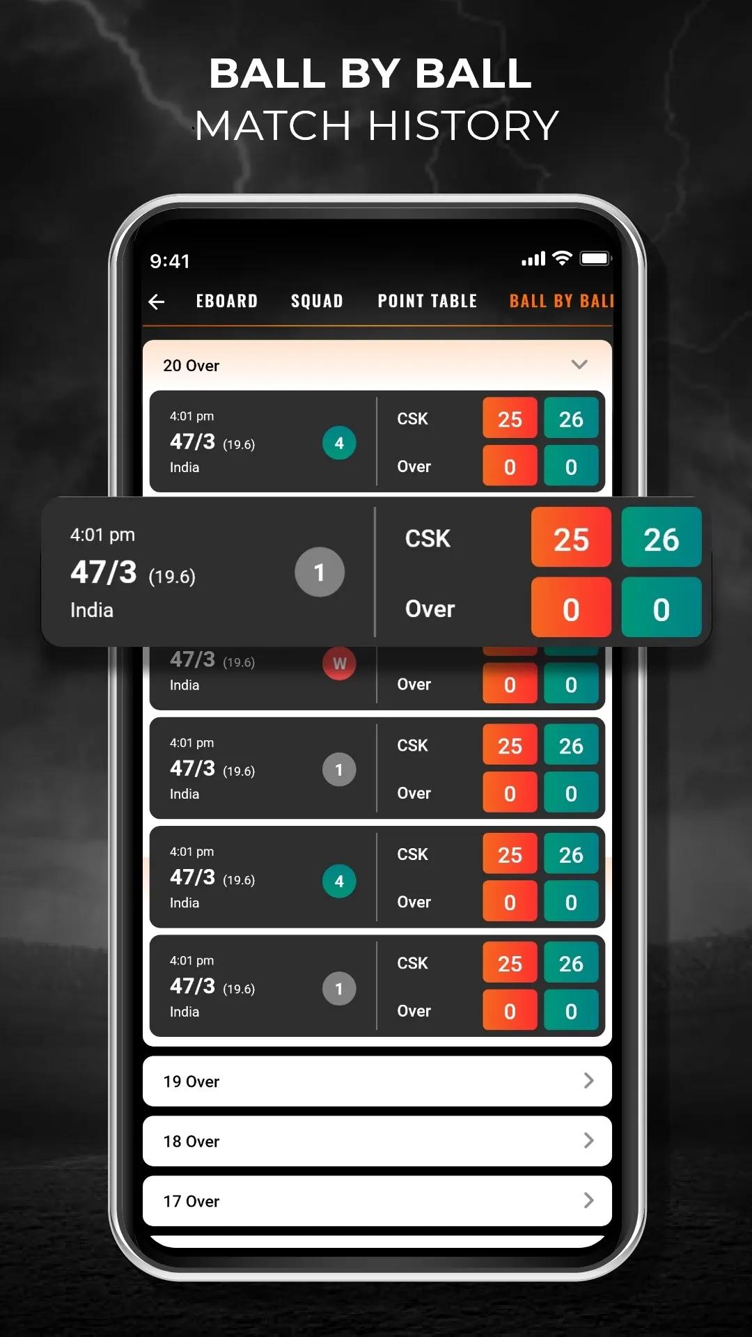
Opening a live match halfway through creates an immediate information problem. The current score tells you where the event stands now, but it does not explain how it got there. A cricket team may be 142/4, a football match may be 2–1, or a basketball game may suddenly have a ten-point difference between the teams. Without earlier context, those numbers provide only part of the story.
Match timelines help fill that gap by organizing important events in the order they happened. Instead of forcing users to reconstruct a game from separate statistics, the interface can show wickets, goals, cards, substitutions, scoring runs and other notable moments in one chronological sequence. For betting platforms that already contain large amounts of live information, this can make an event considerably easier to understand.
A Score Shows the Result, Not the Route
Live scores are designed to answer the most immediate question: what is happening now? That works well for users who have followed an event from the beginning, but it is less useful for someone arriving late.
Consider a cricket match at 142/4 after 17 overs. The score alone does not show whether the batting team recovered from 40/3, lost several wickets recently or has been scoring steadily throughout the innings. Those situations can produce the same headline score while representing very different match histories.
A timeline provides that missing sequence. A user can see when wickets fell, where important partnerships developed and which overs produced major scoring changes. The goal is not to interpret those events for the user, but to make the history visible without requiring a long search through multiple screens.
The same principle applies across sports. A 2–1 football score becomes easier to understand when the timeline shows an early goal, an equalizer and a late second goal. Context changes the meaning of the current state.
Timelines Are Especially Useful for Users Joining Late
Not everyone opens a sporting event before it begins and keeps the screen active until the final whistle or delivery. Mobile users frequently move between apps, check several matches or return to an event after doing something else.
A well-designed timeline acts as a compact catch-up tool. Instead of reading commentary from the beginning, the user can scan a small number of significant moments and understand the broad development of the match.
This becomes increasingly useful during busy sporting schedules. Several cricket matches may overlap, football fixtures can begin at similar times and major tennis tournaments often have multiple courts active simultaneously. Users moving between events need a fast way to recover context. A chronological event history can provide that without requiring the platform to summarize the match in editorial language.
Cricket Needs a Different Timeline From Football
A useful match timeline cannot simply use the same template for every sport. The events that matter and the way time is measured differ considerably. Football naturally fits a minute-based sequence. Goals, cards, substitutions and penalties can be attached to recognizable match times. Basketball can use quarters and game-clock values, while tennis requires sets, games and potentially important breaks of serve.
Cricket has a more distinctive structure because events are organized around innings, overs and individual deliveries. A timeline might highlight wickets, boundaries, milestones, reviews or changes between innings rather than relying on a conventional clock.
| Sport | Useful timeline events |
|---|---|
| Cricket | Wickets, boundaries, milestones, innings changes |
| Football | Goals, cards, substitutions, penalties |
| Tennis | Set results, breaks of serve, tiebreaks |
| Basketball | Quarter changes, scoring runs, major fouls |
| Ice hockey | Goals, penalties, period changes |
The interface therefore needs to respect the rhythm of the sport instead of forcing every event into one universal format.
Not Every Moment Belongs on the Timeline
A live sports feed can contain enormous amounts of data. Showing all of it would defeat the purpose of a timeline. In cricket, displaying every delivery would quickly create a long ball-by-ball feed rather than a concise event history. In football, recording every throw-in, free kick and shot could make important moments difficult to find. Basketball creates an even larger volume of individual scoring events.
The useful question is not whether the platform has the data, but whether a particular event helps users understand how the match changed. A wicket usually qualifies. A goal clearly does. The end of an innings or a red card may substantially alter the structure of the event. Smaller actions can remain available in detailed commentary or statistics without occupying the main timeline. This hierarchy keeps the interface readable and gives important events enough visual weight.
Event Order Can Explain Sudden Changes Elsewhere
Betting platforms contain several pieces of information that change as a match develops. Markets open and close, prices move, statistics update and some selections become unavailable after particular events. A timeline can provide sporting context for those changes without trying to explain or predict betting-market movement.
Suppose a user returns to a cricket match and notices that the batting side has lost several wickets. A quick look at the timeline might show that three wickets fell within four overs. In football, a red card followed by a goal can explain why the current match situation looks dramatically different from the one the user saw earlier.
This is different from an odds-movement chart. The timeline records what happened in the sporting event, while the betting interface separately shows the current markets and prices. Keeping those functions distinct makes the information easier to interpret.
Good Timelines Need a Clear Visual Hierarchy
Chronological information can become cluttered surprisingly quickly. A timeline therefore needs more structure than simply placing every event in a vertical list. Major events should be easy to identify while scanning. Goals and wickets may receive stronger visual treatment than routine substitutions or period changes. Time or over information should remain visible enough to establish order without competing with the event description.
Icons can help, but only when their meaning is obvious. A football icon beside a goal is easy to understand, while an unfamiliar symbol may force the user to stop and decode the interface. Text labels remain valuable when an event cannot be represented clearly by a simple visual cue.
Spacing matters too. If ten events are compressed into a small area, the timeline becomes another dense statistics panel. Giving individual moments enough separation makes chronological relationships easier to see.
Cricket Timelines Can Show Momentum Without Predicting It
The word “momentum” is often used loosely in sport, but a chronological event history can at least show periods in which important events were concentrated.
Three boundaries in a short sequence are visibly different from the same number spread across a long innings. Two wickets in consecutive overs stand out immediately when displayed next to each other. The timeline does not need to label either sequence as positive or negative. The grouping itself communicates what occurred.
This is useful because it keeps the interface descriptive rather than interpretive. Users can see the sequence and draw their own conclusions about its significance. That distinction matters on a betting platform. A timeline should provide information about the sporting event, not present historical sequences as guarantees of what will happen next.
Timelines and Commentary Serve Different Purposes
A timeline can look similar to live commentary, but the two features solve different problems. Commentary provides detail. It can describe individual deliveries, shots, fouls, substitutions or tactical developments. That depth is useful for someone actively following the event, but it can be inefficient when the goal is simply to understand what happened during the previous 30 minutes.
A timeline compresses the same period into its most significant events. Someone who needs more information can open commentary or detailed statistics after identifying an important moment. The timeline becomes the navigation layer between the current score and the deeper match data. This division prevents one interface from trying to satisfy every information need at once.
Returning Users Need to Know What Is New
Timelines become even more useful when platforms remember where a user previously left the event. Imagine someone closing a cricket match at the end of the 12th over and returning during the 18th. Instead of scanning the entire innings, the interface could make recent events easy to distinguish from those that happened before the user’s last visit.
The same concept works in football. A user who leaves at 0–0 and returns to a 1–1 score primarily needs to see the two goals and any other major events that occurred in between.
This does not require complicated personalization. Even a simple “recent events” position or clear chronological grouping can reduce the amount of information users have to process. The important point is continuity. Mobile sports usage is often interrupted, so interfaces should not assume that every visit begins with complete knowledge of what has already happened.
Historical Events Should Remain Stable
Live information changes quickly, but an event that has already been confirmed should become a stable reference point. If a goal is disallowed after review, the timeline should communicate that change clearly rather than simply removing the original event and leaving users wondering what happened. Cricket reviews, corrected scoring decisions and other official changes can create similar situations.
This requires careful status design. An event may initially appear as provisional and later become confirmed, overturned or corrected. The timeline should preserve enough information for users to understand the sequence rather than silently rewriting it. Transparency is especially valuable when someone saw the original event before the official decision changed.
A Small Feature Can Make a Complex Match Easier to Read
Modern betting interfaces can display scores, markets, statistics, commentary, visualizations and account information on the same device. The challenge is no longer simply obtaining sports data. It is organizing that data so users can understand it quickly. Match timelines solve one specific part of that problem. They connect the current state of an event with the sequence that produced it.
For users joining late, returning after a break or switching between several matches, that sequence can be more informative than another large statistics panel. It provides enough history to restore context without requiring the user to replay the entire event in their head. A good timeline therefore does not need to show everything. It needs to show the right moments, in the right order, clearly enough that the current match makes sense again.